DataViz projects

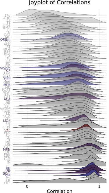
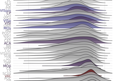
Joy-bringing plots!
For this project, given the large amount of data that I had to visualize, I decided to go for a joyplot, sorting each density plot (i.e., brain region) by its mode.
Click for larger size!
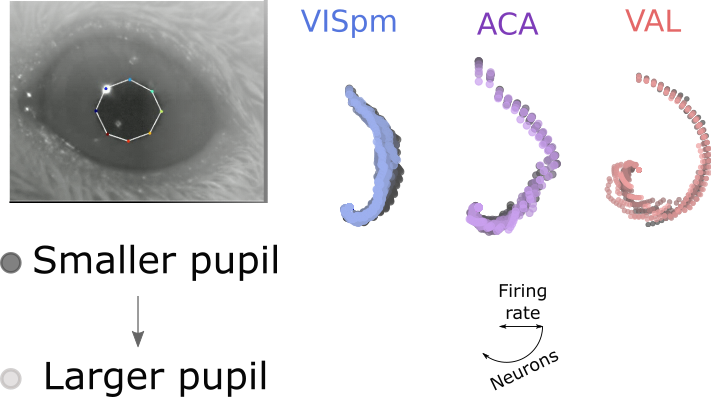
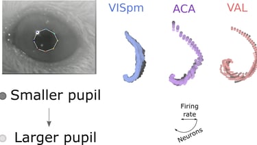
A compact alternative to barplots
For this project, I had to plot over 30 arrays with different colors and shades, so I decided to go for a variation of a radial barplot. Per brain area, each shade indicates a different pupil size and the distance from the center is the firing rate of a neuron.
Click for larger size!
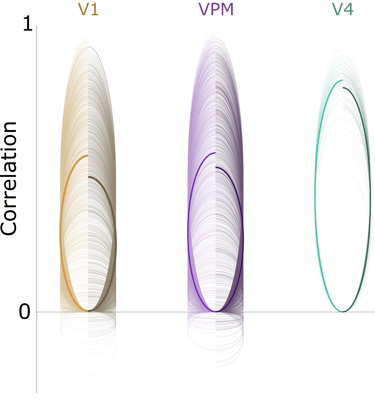
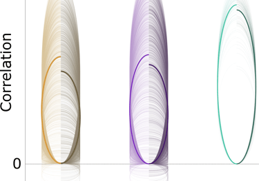
Introducing the slinky plots!
This is an alternative layout for datasets in which a small number of distributions have to be shown and aesthetics are important (i.e. always :D). A single value is represented by the endpoint of a thin arc; the bold ones are distribution averages. Shades mean different conditions.
Click for larger size!
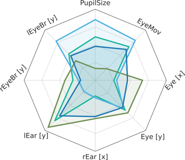
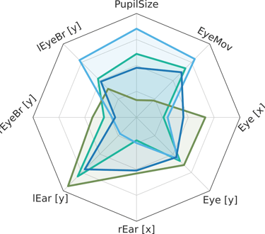
Radar plots can be useful too
As another alternative for bar plots, in this case when we have multiple categories and variables, we can opt for a radar plot, split by category.
Click for larger size!
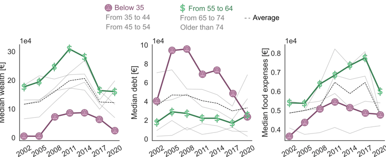
No country for young people
Data visualization of the generational imbalance that, throughout the years, takes place in Spain. Youngsters, as a group, have a higher median debt, lower median wealth and can spend less in food...
Click for larger size!
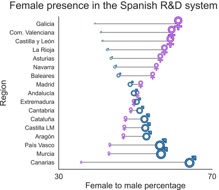
Wild gender balance heterogeneity in the Spanish R&D system
Project to show how well the Spanish R&D sector incorporates female and male workers. The hourglass-like shape shows the enormous regional differences.
Click for larger size!
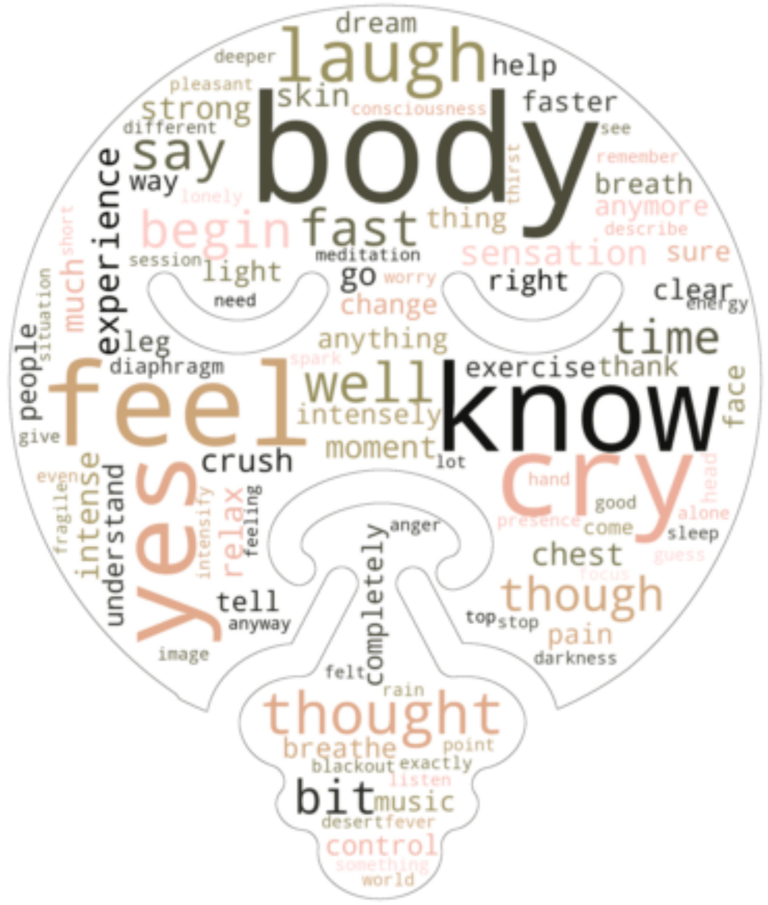

Informative visuals of speech
This Word Cloud layout shows the top most 100 common words in a pool of oral reports from subjects that had undergone a breathwork intervention. For fun, I masked the traditional rectangular layout to follow a breathing face!
Click for larger size!